Finance Management App Mobile UI KIT: Build Smarter Apps Faster
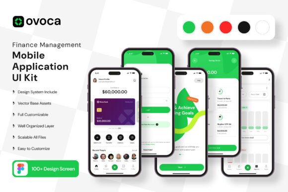
If you have ever tried building a mobile application from scratch, you already know how much time goes into designing even a single screen. Between aligning elements, choosing color palettes, and making sure everything works across devices, the process can quickly become overwhelming. That is where the Finance Management App Mobile UI KIT changes the game. It is a complete set of 100 pixel-perfect screen designs, built specifically for anyone who wants to create a finance-focused mobile app without spending weeks on design work. Whether you are a solo entrepreneur, a designer juggling multiple projects, or a small business owner trying to launch a product, this kit gives you a head start that feels like cheating.
The visual style of this UI kit leans modern, clean, and intentional. Every screen feels purposeful, with a layout that guides the user naturally from one action to the next. The color palette is sophisticated without being cold, using muted neutrals balanced with strategic pops of accent tones. This is not a kit that screams for attention. Instead, it builds trust through clarity and consistency, which is exactly what a finance app needs. Users should feel that their money data is in safe hands, and the design communicates that from the first tap. The typography choices, spacing, and iconography all work together to create a calm, professional environment. There is no visual clutter, no unnecessary decoration. Every element earns its place on the screen.
A Kit Built for Real Workflows, Not Just Pretty Mockups
What makes this collection stand out is how much it mirrors actual user behavior. You get dashboards, transaction lists, spending summaries, account overviews, budgeting screens, goal tracking interfaces, and more. Each screen is designed with the end user in mind, so the navigation feels intuitive. For example, the expense tracking screens use clear visual hierarchy to separate income from spending, and the charts are placed where users naturally look first. This kind of thoughtful layout saves you from guessing what works. You can drop these screens into your project and immediately see how they improve the user experience.
The kit includes 80 UI elements and 100 vector layers, so you are not limited to just full screens. You can pull buttons, input fields, cards, sliders, charts, navigation bars, and other components to build custom layouts. This flexibility is a huge time-saver when you need to tweak a screen for a specific client requirement or add a feature that wasn't in the original design. Because everything is fully layered and organized in Figma, you can drill down to individual elements and adjust colors, sizes, or positions without breaking the rest of the layout. The free vector icons are another bonus. They are scalable, so you never have to worry about resolution, and they match the overall aesthetic of the kit perfectly.
Where This UI Kit Fits Best Across Projects
This kit is obviously a natural fit for personal finance apps, but its use cases go much further. If you are designing a budgeting tool for freelancers, a subscription tracker, a savings app, or even an expense splitting utility for groups, you will find screens that adapt well. The design language is neutral enough to work for both consumer-facing apps and internal business tools. I have seen designers use parts of this kit in fintech dashboards, accounting software prototypes, and even in investment tracking interfaces. The clean, modern typography and use of whitespace make it suitable for any project where financial clarity matters.
On the branding side, this kit helps you establish consistency across an entire product suite. Because the screens follow a unified design system, your app feels cohesive from the onboarding flow to the monthly report view. This kind of consistency builds brand recognition over time. Users learn where to find key information, and that familiarity reduces friction. For marketers and content creators, the kit offers a solid foundation for creating app previews, social media graphics, and promotional materials that reflect the actual product experience. Instead of mocking up a generic phone screen, you can showcase real-looking interfaces that resonate with potential users.
Print projects might not be the first thing that comes to mind with a mobile UI kit, but the design principles here translate well. The color palettes, typography pairings, and spacing rules can guide the look of user manuals, onboarding booklets, or presentation decks. The same visual language that works on screen can carry over to print collateral, giving your brand a consistent voice across mediums. For bloggers and publishers writing about personal finance, using screens from this kit can illustrate articles with realistic, professional-looking examples that elevate the content.
How Design Influences Trust and Engagement in Finance Apps
In the finance space, design is not just about looking good. It is about making people feel confident. When a user opens an app to check their balance or track spending, they need to process information quickly. Visual hierarchy does the heavy lifting here. The Finance Management App Mobile UI KIT uses size, color, and placement to guide attention to the most important data first. Your monthly spending total, for instance, sits prominently at the top of the dashboard, while secondary details like category breakdowns are positioned below. This hierarchy reduces cognitive load and helps users make decisions faster.
Readability is another critical factor. Finance apps often deal with long numbers, dates, and labels. If the typography is cramped or the contrast is low, users will struggle to scan information. This kit uses generous spacing, comfortable font sizes, and high-contrast text against clean backgrounds. The result is an interface that feels open and easy to read, even on smaller screens. When users can quickly find what they need, they are more likely to stick with the app long term.
Brand perception also gets a boost from a polished UI. A finance app that looks dated or confusing sends a signal that the company behind it might not be reliable. On the other hand, a clean, modern interface with consistent design elements tells users that the product is professional and well maintained. This kit gives you that polished look without requiring a dedicated design team. You can present your app to investors, clients, or users with confidence, knowing that the visual presentation matches the quality of the functionality.
Practical Guidance for Getting the Most Out of This Kit
When you start working with the Finance Management App Mobile UI KIT, take some time to explore all 100 screens before making any changes. Open the file in Figma and browse through the pages to get a feel for the full range of layouts. You will likely find screens that solve problems you had not even thought about yet. Once you have a mental map of what is available, start customizing.
Begin with the core screens that define your app's primary workflow. For a budgeting app, that might be the dashboard, the expense input screen, and the category breakdown view. Keep the original design as a reference and branch off from there. Because the kit uses symbol objects and layered vectors, you can quickly adjust colors to match your brand palette without manually editing every element. Change the primary accent color on one master symbol, and it updates across all screens. This kind of efficiency is invaluable when you are iterating on a design or creating multiple variations for A/B testing.
Think about font pairing as you customize. The kit comes with a free font that works well for body text and labels, but you might want to pair it with a display font for headings or logo placement. Since the free font is clean and legible, it plays nicely with most sans serif options. For a finance app, stick to fonts that feel stable and professional. Avoid overly decorative or script fonts in the main interface, as they can reduce readability and make numbers harder to scan. Reserve those for branding elements or marketing materials where you have more creative freedom.
Commercial licensing is another consideration. The UI kit itself is licensed for use in commercial projects, meaning you can build apps for clients or your own business without worrying about legal issues. However, the preview images used in the demo are not included in the download files. That is standard practice with design assets, so plan to replace any placeholder imagery with your own content. The icons and UI elements are fully yours to use and modify, which gives you plenty of room to create a unique product.
Testing your screens on actual devices is still essential, even when starting from a polished kit. What looks good on a Figma canvas might behave differently on a phone screen, especially with dynamic type sizes or accessibility settings enabled. Use the kit as your starting point, then simulate different text sizes and screen resolutions to make sure everything holds up. The flexible layers and vector elements make these adjustments straightforward, so you can fine-tune without rebuilding from scratch.
Final Thoughts on Building with This UI Kit
The Finance Management App Mobile UI KIT is more than just a collection of templates. It is a design system that saves you time, enforces consistency, and helps you create an app that users trust. For designers, it removes the repetitive work of drawing common UI elements from scratch. For entrepreneurs and small business owners, it provides a professional visual foundation without requiring deep design skills. And for marketers and content creators, it offers ready-made visuals that communicate credibility and polish.
If you are working on a finance app, a budgeting tool, or any product where numbers and clarity matter, this kit gives you a strong starting point. Spend a little time learning the layout of the screens, customize thoughtfully, and test on real devices. You will end up with an app that looks like it was designed by a dedicated team, even if you are building it on your own. That kind of advantage is hard to beat, especially when you are racing to launch or trying to stand out in a crowded market.